Fashion backward: What alternate uniform from the Packers’ past should we see in 2015?
By Griffin Gotta
Special to Packerland Pride

The 1994 Packers throwbacks were based on these uniforms worn from the late ‘30s through the ‘40s. (Photo via Packers.com)
The alternate third uniforms donned by the Green Bay Packers over the last five years celebrated the franchise’s first world title in 1929. How the blue and khaki-ish brown, the circular design around the numbers, translated to you is a matter of personal taste. But they were unique, and their point – honoring the team’s past, its first taste of title glory – was successfully taken. This is not to mention the boatloads of offshoot blue and gold Acme-inspired apparel the team unquestionably sold in step with the jerseys on the field. In many ways, then, Green Bay’s latest alternate uniform was a winner.
Possibly more than other NFL teams, alternate uniforms can make a slightly larger splash in Green Bay. The team’s respect for history – their ability to wisely avoid the modern day temptations of frivolous uniform tweaks and alterations – keeps the Packers in the increasingly-rarefied air of decades-long uniform consistency. “We are the Green Bay Packers,” head coach Gene Ronzani said in 1950 after taking over for Curly Lambeau. Ronzani was emphasizing the franchise’s rightful shift, officially, to green and gold as team colors. Away from the Notre Dame-esque blue and gold scheme Lambeau brought along from his college days. Ronzani didn’t have much success following up Lambeau’s legendary 30-year act (who could?), but he started the team on the iconic sartorial path they remain on today. Across the vast sports landscape, a green and gold color scheme directly registers with Green Bay and the Packers first and foremost. They’ve essentially had their current look – with slight changes to areas like piping, striping, number and logo placement – since the early 1990s. Their consistent look, the way they appeared basically the same way to your mom and dad when they were growing up as they do today to you, is one part of the Packers’ successful generational pull. There is no confusion over which team you’re cheering for. They are possibly the easiest team to identify in the league. (Others that come to mind – the Bears, Cowboys, purple-wearing Vikings, and Steelers all stand out for either historical consistency or individuality within the league – could also have a say.)
Through the aforementioned touch-ups and patches come and gone, the Packers have remained green and gold for over 60 years. In general they have two sets of uniforms, one helmet, one iconic oval-shaped “G”. But within that framework there have been many shifts in style. Some have been larger than others, some downright strange to see looking back today. Some look more green and gold in the Nike-fied Oregon Ducks sense of the term than the simpler Green Bay one.
***
In late March, Packers president and CEO Mark Murphy said that sometime before the 2015 season kicks off the team will unveil a new third alternate uniform to be worn on select Sundays.
Here’s Murphy, from a Green Bay Press-Gazette interview: “We’re definitely going to do it, it will come up soon. It’s going to be exciting. It’s going to be an old jersey. It won’t be a modern jersey, a Nike … This will be from a past era. I think the fans like it. From what I’ve seen those games are always kind of fun and the players really enjoy it, too.”
With the Packers recently diving deep into the past with their 1929 blue-and-gold selection, where are they going next in the team’s past to find their newest re-release? We can speculate now; the actual answer could depend on how weird they’re willing to get.
***
The early days of professional football were dangerous, primordial times in the sport’s life. The uniforms of the time reflected that. Leather “helmets” – because that sounds better than saying “slightly heavier hats” – maybe some light leg and shoulder padding, a jersey, and a pair of likely beaten-up shoes. These are wince-inducing to look back on knowing what we know now, but more a sign of the times than anything aesthetically designed to be worn for the purpose of boldly making a statement with a look.
Throwbacks to that time typically seem to be the first thought where alternates are concerned. There are only so many ways to do blue and gold uniforms with the leatherheads-style helmet that we haven’t yet seen. Especially because the team had to switch from a solid brown, leather-look alike-style helmet to a solid yellow one because of safety issues. These have been done. And while a changeup is always fun, now is the time for a changeup to the typical Packers type of uniform changeup.
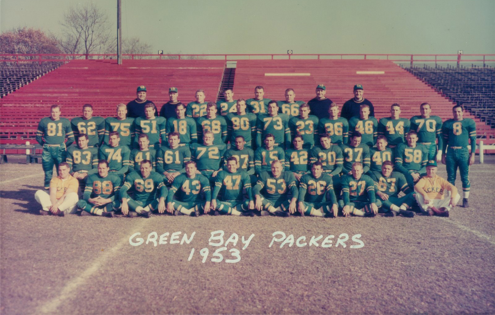
Lambeau was still over a decade from falling off his throne atop the Packers kingdom when he decided to take the team for a cosmetic spin. Beginning halfway in 1935 and spanning into 1936, the year of the Packers’ fourth NFL championship, the team dressed in green uniforms with gold numbers, long gold sleeves, solid gold pants with green and white socks. Helmet technology was still in an infantile state, so they remained off-yellow with stripes running front-to-back across the top. These uniforms were eventually switched back to blue and gold. The gold sleeves were trimmed to stop around the shoulder, making a gold collar that finished with a dark blue sleeve to the wrist. In 1994 the Packers donned throwbacks to these. They were meant to highlight the team’s lineage from the late ‘30s through the end of the Lambeau era. The bright green jerseys that lived briefly before the return to blue, however, were never seen again. Consider these Offbeat Option No. 1.
And then there were Ronzani’s radical changes of the ‘50s. Offbeat Option No. 2. Again: If the Packers really want to dive into unknown or forgotten territory with their next alternate pick (and why not?), this is the period they should dig out of the closet.
He wanted an emphasis on the green in Green Bay. And boy, did he make that happen. Ronzani put green in the forefront with all the subtlety and nuance of a radioactive Christmas tree.
From 1950 to the end of his tenure in early 1953, the Packers wore bright green from ankle to shoulder. The only hints of gold – gold striping up the pant, gold stripes around white socks, a thin gold belt, gold piping on the arm sleeve and gold numbers – broke up what otherwise would have left the team looking like a giant patch of well-manicured grass. During this timeframe Ronzani also rolled out the polar opposite: All-gold uniforms with green striping and numbers.
The monochrome uniform style has been adapted by teams recently in league history. Often they are used sparingly, or for special or higher-profile games. The Ravens and Panthers and Saints go all-black when they want to look extra menacing, for example. Probably for a night game.
If it’s mixing past and present that Green Bay is aiming for today, Ronzani’s out-there uniforms fit the bill. They would surely elicit strong reactions from the fan base. And, just as surely, sell merchandise. They’ll still have that oval “G”, after all.
There are more conventional options. Or choices better aligned with successful periods of Packers history. But if the team is looking for a true alternative to trot out in 2015, the one-color combos of the early ‘50s are untapped, wonderfully weird uniforms long since left behind.
Maybe, instead of bringing back eras of past success to remember fondly for the umpteenth time, the Packers could give a slice of history – one that didn’t deserve much attention back then – a new chance to be seen in a different light.